

Aanchir
-
Posts
8,252 -
Joined
-
Last visited
-
Days Won
81
Content Type
Profiles
Forums
Gallery
Events
Blogs
Store
Raffles
Posts posted by Aanchir
-
-
Just a fan theory that was also re-released on the Faber Files blog that gave some insight to the brainstorm of the Bohrok enemies.
Nitpicking here, but that's not quite correct. It was a concept idea that the Bionicle team never used that was leaked and inspired a fan theory.
I don't know if it's fair to say that it was leaked. It was a part of a press kit, and the whole reason press kits like that were sent out was for sites like KanohiPower to report on them.
-
Lego Dimensions is a video game. Every toy adds onto that video game, and expands the experience within the video game; any discussion of Lego Dimensions would belong within this video games sub-forum. Lego Fusion would be the same.
By that logic, wouldn't all discussion of the Hero Factory Breakout and Brain Attack sets go in the video games subforum? After all, Hero Factory Breakout and Brain Attack were mobile and online games, and every toy from those series added on to those mobile games and expanded the experience within those mobile/online games (via the codes on the Hero Cores they included).
Face it, LEGO Dimensions is both a video game AND a series of LEGO building sets. With some other toys-to-life games you might be able to convince somebody that the toys "aren't real toys" and are just glorified DLC, but with LEGO Dimensions the physical play potential is painfully obvious, and there are many people who will buy LEGO Dimensions packs solely for use as toys without having any interest in the digital contents.
-
Really? When I checked Lego's site last night, they were listed as $15.99...
But then, I recall some of the other sets seeming a bit overpriced, too. Maybe someone made a mistake and the prices will drop by a few bucks when they're actually released. That would be nice.
EDIT: Just double-checked, and yeah, all the prices are horribly inflated. The VIP points are fine, though, so you can tell what price they're supposed to be.
Are you sure you're checking the U.S. site and not the Australian site? The Ultimate sets cost $15.99 Australian dollars, but just $9.99 U.S. dollars. And the LEGO Shop website reflects this.
-
The problem with a "general online + video games" forum is that it messes with our theme-oriented forum structure.
For example, if I wanted to go discuss Bionicle: Mask of Creation, that's Bionicle Discussion, but if I'm going to discuss a ninjago game...or if I'm going to discuss the Hero Factory breakout game...online games tend to be themed in a way that video games aren't.
Also, considering that Ninjago is going to get its own movie next year, getting rid of the Ninjago subforum seems incredibly brainless.
Why Software was eliminated before the theme-oriented switch probably had to do with lack of activity - it was folded into Media Discussion.
There is an inherent benefit in having one place to discuss all of them in one place, however, versus any topics being swallowed amid all of the other discussion in the more generalized forums.
Swallowed amid all what other discussion? Very little discussion takes place in the non-Bionicle forums as it is. If people wanted to discuss non-Bionicle video games, there's no reason why they couldn't do so in the current Ninjago Discussion and LEGO Discussion forums. Those forums could use the activity anyway. If video game discussions in these forums tend to die, it's not because of a flood of new discussions crowding them out, it's because people don't have very much to say about them.
As for Bionicle video games, there's only been one so far for G2, and discussions of the G1 video games tend to do just fine in the Bionicle Discussion forum until people run out of things to talk about. Because let's face it, they're old games, so there aren't a whole lot of new discoveries and developments to discuss. We can only talk about the things we loved best about Mata Nui Online Game for so long before everything we have to say has been said.
Another problem that I ought to bring up: LEGO Dimensions. Is it a toy? Is it a video game? It's kind of both. And yet it'd be extremely impractical to try and keep discussion of the toy aspects and the game aspects separate. Same goes for LEGO Fusion and other attempts to integrate physical and digital play.
-
 1
1
-
-
Gali's design is generally good, aside from her shoulders being too high for the length of her arms. I love the asymmetry of her armor and her exciting color scheme, although her thighs are really bony compared to the 2015 version, and I wish there were an easy way to change this without sacrificing the other aspects of her design. It's surprising how narrow her shoulders have become — narrower, in fact, than the shoulders of any previous Toa of Water. I actually wouldn't have minded if they were a bit wider. And I'm not a huge fan of how tall the Toa in general have become.
Gali's new weapon is nice, and a good evolution of her harpoon from last year, although the dual functionality of the 2015 weapon will be missed, and I wish Pohatu's new weapon weren't so similar to Gali's in structure. Gali's new mask is awesome in both its color combinations, and I'm glad the gold mask stands out from the rest of the build. I love Gali's combination with Akida, which feels incredibly elegant and retains the creature's functionality (unlike Kopaka's combination with Melum or Pohatu's with Ketar).
Overall, I think I prefer the 2015 version of Gali. The 2015 Toa did such a good job capturing so many of the best aspects of classic Bionicle — geared shoulders, dual-function weapons, colorful armor, and diverse, slightly exaggerated proportions. It's ironic that in spite of all the pleading for greater use of Technic, these sets which use Technic so extensively actually feel less like classic Toa than the 2015 versions when it comes to builds, functions, and proportions. No official Toa sets ever had torsos this intricate, nor shoulders this narrow relative to their height. But this version of Gali is still probably my second favorite of the 2016 Toa, after Lewa. Her design, in spite of some strangeness, still feels very coherent and purposeful, which is more than I can say for Tahu or Kopaka.
-
3
-
-
Is the general consensus that aside from Umarak and Onua, the 2016 sets are generally worse than their 2015 sets until you add their respective Creatures?
I like 2015 Onua better than 2016 Onua, just in terms of having a more original physique, but I'm not so sure about which version of Lewa I like better, and probably won't be able to come to a firm decision until I have the new Lewa in-hand.
-
I'm not a fan of the blended masks. Mainly because the last time we had blended masks it was because their powers were being drained.
I guess now it can signify that their powers are "incomplete" and need to unify with the elemental creatures. But then why do they have blended gold masks? It just seems like a gimmick to me.
Well, arguably it is. But ALL masks are a gimmick in the grand scheme of things. They're the original gimmick.
-
2
-
-
I like the cute "freshman" computer experts. I hope they return in some form, although given the existance of Merlock 2.0, I may be disappointed.
Ava and Robin both seem like they'll stay on board as supporting characters. It's entirely up in the air whether we'll ever see them achieve full knight status, but I certainly don't expect them to just disappear from the story after the first few episodes.
-
I'm sure the Bionicle webisodes made up a part of these numbers. Bionicle has had a pretty impressive social media presence in general for a theme its size!
-
I'm amazed by the prices of the new sets. 7 Pounds for a creature, 10 for a smaller toa, and only 20 for the unity set. Did the gearbox really ramp up the prices that much?
Since the prices in the US stayed the same, and the GB prices are now closer to straight conversions of the US prices, I imagine it has more to do with LEGO just trying to smooth out some of their international pricing discrepancies than anything that changed about the set designs themselves.
-
Where is your local TRU, Wazdakka? I must soon find out if it's at others.
Also, a slight discrepancy I've noted: Are the smaller Uniters Lewa, Gali, and Pohatu supposed to be $20 or $15? Because for some reason at the LEGOLAND Center in Atlanta, they're listed at $20, which is also the same price that Tahu and Onua were being sold at.
They're supposed to be $15. I wonder if the LEGOLAND Discovery Center is only jacking up the prices because they're (currently) the only place that has them, or just because they're a high-traffic store that people are willing to spend more at. Kinda screwy either way, but if it's the former they might drop the price back once we hit January.
-
The Toa Inika had insantely long arms and legs while having a flat torso, while taking into account that the general body shapes and part shapes of every Toa was unique and weird compared to that of a normal human being. I like that kind of weird.
I mean, I can understand liking the weirdness of Toa Inika proportions. It just doesn't make sense to me to think of those and the 2016 Toa's proportions as the same kind of weirdness, since they're practically polar opposites — the Toa Inika had short torsos and long arms and legs, the new Toa have long torsos and (in many cases) short arms and legs. In pretty much every way other than torso thickness, the Toa Inika/Mahri/Phantoka/Mistika were far more like the 2015 Toa than the 2016 ones.
-
I feel that while the 2015 Toa were great humanoid figures, I think the 2016 Toa are great TOA figures. Throughout G1 the Toa have always had their own unique set of proportions, and that was one of the many reasons I loved them. They were similar enough to us that connecting with them was easy, but they were different enough that you could easily tell them apart from other humanoid-like beings. One of the best things about BIONICLE was that it was really weird but at the same time very interesting and mysterious. I think the early commercials are a good example of the feel they went for.
I'm a bit confused at how you arrived at these conclusions. To me it seems like the opposite is true. The 2015 Toa's proportions were a lot more unique AND more like past Toa sets than the 2016 Toa's generic proportions.
2015 Gali had almost the same proportions as an average Toa Metru, just with upper arms one module longer. 2016 Gali's shoulder joints are the narrowest any Toa's shoulders have ever been (7 modules) and her legs and arms are the same length as in 2015, but her torso is two modules longer and her shoulders one module higher relative to her neck joint. 2015 Tahu had basically the same proportions as a typical Toa Inika, except his arms were four modules shorter. 2016 Tahu's legs, arms, and shoulders are the same size as the 2015 version, but his torso got two modules longer. None of these changes make them more "Toa-like". The only way I can think of that the 2016 Toa proportions are more "Toa-like" than the 2015 versions is that their torsos are flatter.
EDIT: I tried to edit this post as much as I could for clarity, but proportions are tough to describe in text in a way that makes them easy to visualize! So I whipped up an LDD file as visual reference.
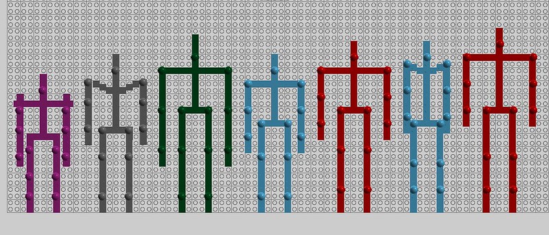
From left to right: typical Toa Mata, average Toa Metru, typical Toa Inika, 2015 Gali, 2015 Tahu, 2016 Gali, 2016 Tahu. As you can see, 2015 Gali and Tahu's 2015 proportions are pretty close to the proportions of the Toa Metru and Toa Inika. 2016 Gali and Tahu's proportions aren't very much like any previous Toa.
-
2
-
-
Who sets themselves a limit of a minute and 30 seconds? That was a stupid idea that held back the potential of the animations.
Probably a way of cutting costs. The animation studio probably charges based on length of animation. As you say, though, it's unfortunate that they set this limit on the main vehicle of the storyline.
Actually, at NYCC they mentioned the reason for it was to make the videos "shareable" via social media — something that people could watch while scrolling through their Tumblr dash or Facebook news feed without worrying about it taking up a lot of their time. The G1 webisodes from 2002 and 2003 did include "E-mail to a friend" links, but that's a whole different ball game than today's social media landscape.
I doubt it had anything to do with cutting costs, since the webisodes as a whole add up to nearly 30 minutes of animation, so it really wouldn't make any difference cost-wise whether they broke it into eighteen 90-second episodes, nine three-minute episodes, or three nine-minute episodes. All together, the Okoto webisodes from 2015 are longer than the Bohrok webisodes from 2002, just broken apart into shorter chunks. Obviously, doing more webisodes would have cost more and taken more time to produce, but that wouldn't necessarily mean making changes to the length of the webisodes individually.
-
2
-
-
I don't see why anyone thinks he has too much silver. I mean, Toa Norik had way more silver (in terms of how much of his body it covered) and I've never heard anyone complain about that set's color scheme. The 2016 Pohatu's got silver boots, silver gloves, silver shoulders, and a bit of silver on his mask. That's it. 2015 Pohatu had way more silver, and yet I feel like his color scheme felt way more unified than this set's.
Really, I think it's all that Sand Yellow that's really screwing up Pohatu's color scheme. It doesn't contrast with the silver anywhere near as well as the Dark Orange in 2015 Pohatu's color scheme did. If his torso shell and thighs had been Dark Orange instead of randomly introducing yet another new color to his color scheme, he'd have felt a lot more unified. If I had to revamp the present set, I think changing the shells on his forearms and thighs to Dark Orange 4M shells would be an obvious first step. With how huge the torso shell and how it's at the center of the design, I think it can probably stand on its own without needing any more of that color to reinforce it.
The silver boots are probably the best thing this set has going for it. They create continuity with the 2015 design (which had similar boots, just using the piston add-on in place of the crystal add-on) and look pretty solid to boot. (I'm so, so sorry)
Overall, I agree with the review that Pohatu's spear just doesn't feel that well-suited to him. It also feels a bit redundant since it's so similar to Gali's weapon. If I were designing the set I might've skipped the crystal blade and instead given the boulder a similar two-color blend to reinforce the crystal motif. I also agree that Pohatu's combination with Ketar is by far the clumsiest-looking "unity mode" of any of the Toa, though this is more a problem with Ketar than with Pohatu.
-
2
-
-
I've got a LEGO Inside Tour exclusive Tr. Blue Mask of Water (only 250 produced, only 200 distributed), and a Bionicle 2015 T-shirt from New York Comic Con. Not sure which of those is rarer? I'm sure the mask is more valuable either way.
I also have a BZPower 2015 T-shirt in light yellow with red printing, which is rarer than any of the other things I've mentioned, but that's not really official Bionicle merch so I don't think I'd count that.
-
1
-
-
Nothing springs to mind that I totally hate about the webisodes. I do wish there were more of an opportunity to focus on the Toa learning to admit to their own weaknesses and tolerate and appreciate one another's weaknesses and strengths. Maybe the Netflix series will offer more of an opportunity for that. I also wish Onua's lethargy, Pohatu's fear of the dark, and Tahu's forgetfulness were brought up more. And it would've been nice if Gali got more opportunities to shine. I also would have liked to see opportunities for the Toa to form some more individual bonds, like how Pohatu and Kopaka or Lewa and Onua ended up being there for each other a lot in G1.
A lot of these things might've required increasing either the length of the webisodes or the number of webisodes. I don't think we needed more or longer webisodes to tell the story they set out to tell, but it would've been nice for them to have had an opportunity to tell more stories. The webisodes were good in my opinion, but they could have been better.
-
Am I the only one a little wierded out by Jestro's completely exposed, skinless muscle showing through his clothes?
I thought that was just his underwear, or the inner lining of his jester costume. It's way too straight to be muscle, especially on his torso — real torso and leg muscles tend to go in all sorts of directions; whereas the "stripes" under the clothing of the Jestro minifigure are perfectly, unerringly vertical. You're definitely not the first person who's thought it looks like muscle, though.
-
(ever heard of blue fire!?!?,or have you ever seen fire to begin with!?!?)
Jess addressed the bigger points above, but DeeVee also made it pretty clear in the review that he LOVED the Dark Azure accents and they weren't what made the set look messy to him. Rather, that complaint was about the disorganized shapes and textures.
Having met him, seen the brilliance of his creations in person, and gotten constructive criticism from him about my OWN creations, DeeVee definitely has an artist's eye. But not all artists see things the same way, especially if they come from different backgrounds. He and I certainly don't agree on everything, but that doesn't make his perspectives on the things we disagree about invalid or unreasonable.
-
So excited for the new Lyra and Bon Bon chapter book! It'll be great to see these two best friends on an adventure together! I've really enjoyed all G.M. Berrow's other My Little Pony chapter books, so I have high hopes for this one!
-
The things I do not like 2016 Tahu are firstly not the absence of red but the inclusion of the blue, it seems a little out of place on the Toa of Fire.
Fire can be blue.
The blue, in fact, is one of the nicer touches on Tahu, IMO.
Regardless of how they turned out, you can't blame Lego for not trying to do some cool stuff with secondary colors this year. Generation 1 was all about establishing these paradigms out of arbitrary stuff: fire is hot, so their colors can be red/orange/yellow; water is cool, so they get blue/light blue/green.
In Gen 2, the elemental color motifs we're getting are far less abstract:
- Tahu has red as his primary, but blue flames exist so they accent the primary color. Which is fitting for his personality: one might look at the blue flames (hottest part of the flame) as a symbol of intensity OR as a cool color representing his good heart
- Gali has blue as her primary, but the orange that accents it can stand for sea life like coral. Incidentally a great care for life is part of Gali's personality.
- Onua has black (color of dirt) as his primary color, accented heavily with trans purple. I really think that color brings to mind crystals.
- Pohatu had tan in Gen 1 as well but I think the tan and chartreuse-ish we get in 2015 really calls to mind the desert: sand and sun, respectively.
Red/azure, blue/orange, black/purple, and brown/yellow-green are really brand new "universal" element schemes that are repeated between sets and I'm really liking the amount of variance in color, even if a lot of the sets don't quite hit the mark.
Well, G1 did do some interesting things with accent color, like how Toa Inika Hahli used a lot of White pieces and Toa Mahri Hahli used a lot of Bright Yellowish Green. But those particular examples weren't all that well received at the time, for various reasons. The 2001 Matoran also tended to have pretty creative accent colors, as did some enemy characters like the Visorak. It's nice that G2 Bionicle is bringing vibrant accent colors into the Toa sets so early on, though!
-
Of the 2016 wave, I'm only getting the First Order Stormtrooper and Captain Phasma. I still think CCBS looks the best on fully-armored characters. Rey's head does look decent, but her arms and legs look so inorganic with CCBS. I do appreciate what I assume to be her gear function. Poe and Finn look all right, but not really worth getting. Tempted to buy Kylo, but I'm still not sold on these Buildable Figures enough to put more money into the ones that don't immediately jump to me (Stormtrooper and Phasma).
The First Order Stormtrooper and Captain Phasma are easily some of the most aunthentic-looking characters in this series so far, but from a design standpoint they kind of bore me. They're very monochrome, and their armor design in the sets is pretty generic, and not much different from other Star Wars figures like Cody, Jango, and even Kylo Ren (though Kylo Ren has the cloth parts to help him stand out). The "good guy" characters (besides Luke) tend to have a lot more interesting outfits and color schemes, IMO.
I will say that I would be a LOT more interested in Phasma and the First Order Stormtrooper as parts packs if my brother and I hadn't already bought Jango and Obi-Wan, who they share a lot of their armor pieces with. But because we did already get those two sets, some of the only parts from Phasma and the Stormie that I don't already have are Phasma's cape and the 6M shells on their thighs, which are new in both White and Silver. The helmets and blasters too, but I don't have a whole lot of use for Star Wars helmets in MOCs, and the blasters also come with Finn and Poe.
Before I saw The Force Awakens, I really didn't have much personal interest in this series except as parts packs. But now that I've seen the movie I can also relate to its protagonists a lot better as characters, arguably better than any of the PT/OT characters from the first wave. So I might even keep Finn and Rey together longer before I start borrowing parts from them for MOCs. We'll see!
-
I'm on the fence about Lewa, so I won't be placing my vote until I actually own the Lewa set. I loved the 2015 version, but as Lyi points out, the 2016 version does some brilliant things, and is without a doubt the most coherent-looking of the 2016 Toa. Its biggest faults as far as I can tell are that its arms are too short and it could use more of a contrasting color, like Bright Yellow (which works great for Uxar).
I definitely prefer the 2015 Gali and Pohatu to the 2016 versions, though the 2016 Gali still looks like a great set in her own right. Just not as great as the 2015 version was. I don't like how bony the 2016 Gali's thighs are, but her color scheme and asymmetrical design are great, and her mask is a nice evolution of the 2015 Mask of Water. Like Lewa, her arms are a bit too short.
-
From what I've seen so far, Tahu disappoints me. He was already one of my least favorites of the 2015 Toa, but he was still an excellent set, just as all the 2015 Toa were excellent sets. His shaping, texture, and color distribution felt coherent and purposeful. Neutral skeleton, silver extremities, smooth, red and orange armor that flared out at the ankles and shoulders, and decorative gold detailing. His textures felt consistent, and really the most bothersome thing about him was how long his upper legs were (though there was something poetic about him being the tallest member of his team).
Fast forward to today. Now, Tahu's colors, textures, and shapes are distributed much less evenly and purposefully. His legs are just as long, but his upper legs are now even more scrawny, and he's lost the flared shape of his lower leg armor. As the review states, his many textures compete for attention. I've warmed up to some aspects of him, but no matter what, he just doesn't feel as coherent to me as the 2015 version. I wouldn't even care that much about how much gold he has if his colors in general didn't feel so scattered and chaotic. I can't say for sure that ANY of the 2016 Toa really feel as good as their 2015 counterparts, except maybe Lewa, but Tahu really feels like he's lost a lot of what made the 2015 version great.
His weapons are nice, at least, though I already mentioned the poor color matching of the crystal blades in response to Ikir's review. It'd be nice if those were just a little more reddish. His mask is also a good design, and I don't think either of the color combinations looks bad. And the Dark Azur accents are quite tasteful. Still, I'm glad you chose to get and review this set, DeeVee, because it's begging for a revamp and I'm sure you'll be able to deliver.
-
6
-
"Gathering of the Toa": Official Discussion Topic
in Bionicle Discussion
Posted
I went out and got this book this evening! It's a fairly quick read, but still a lot of fun. It's way better than the preview pages led me to expect. The artwork is pretty nice throughout most of the pages (it's just a few of those early ones that are kinda rough), and the colors are bright. The masks sometimes look off-model, but not to the point that you can't recognize the characters.
There are definitely still a number of errors of the sort we've come to expect from Bionicle comics by now — masks colored incorrectly, speech bubbles pointing to the wrong characters, etc. But I'd say the quality of the stories makes up for it. Great characterization, and lots of heartwarming and humorous moments. Very much looking forward to Battle of the Mask Makers!
Other than the bits about the Mask of Time which I believe have already been shared, there's not a whole lot of new information in "The Okoto Protectors' Guide". The only info from that section which we haven't seen previously is the stuff about the Temple of Time and the Mask of Time. There is what appears to be concept art for the Temple of Time, which looks different than it did in the webisodes. Instead of having a giant pendulum, it's an hourglass-shaped tower. Interesting.